Rebranding Liquitex as the go-to brand for acrylic artists
Conceptual design
Creative direction
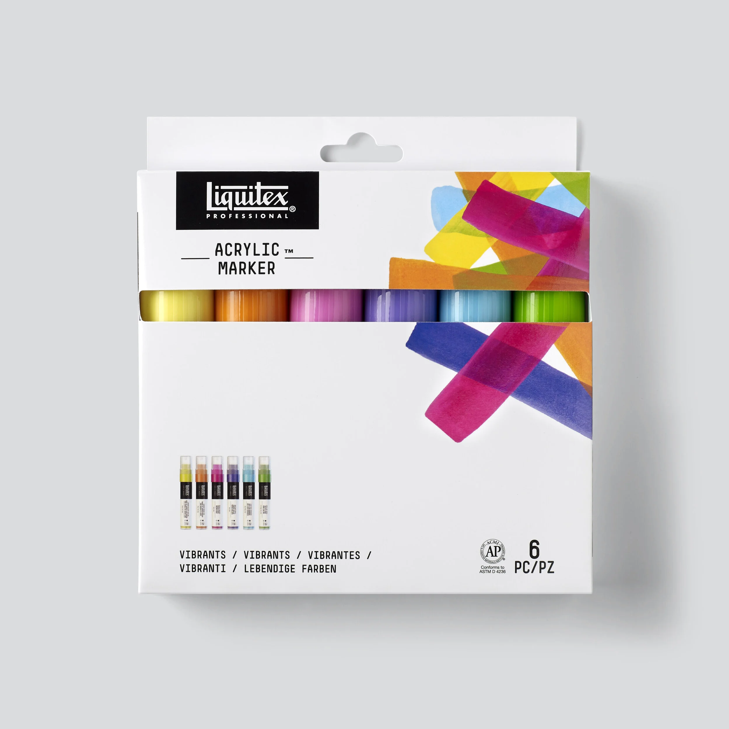
Packaging
Guidelines
Photography
POS
Website design
Ecommerce assets
Social media assets
Offering the largest number of acrylic paint products in the world, Liquitex needed to update their identity to simplify their design language, create a consistent look across all touchpoints, and engage new audiences.
We undertook a full rebrand, giving them a clean, modern aesthetic, repositioning the company as a technical tour de force in its field. Photography of beautiful paint textures set against pure white backgrounds showcases the richness and vibrancy of the acrylic paint, letting the product simply sell itself.
Painting a picture
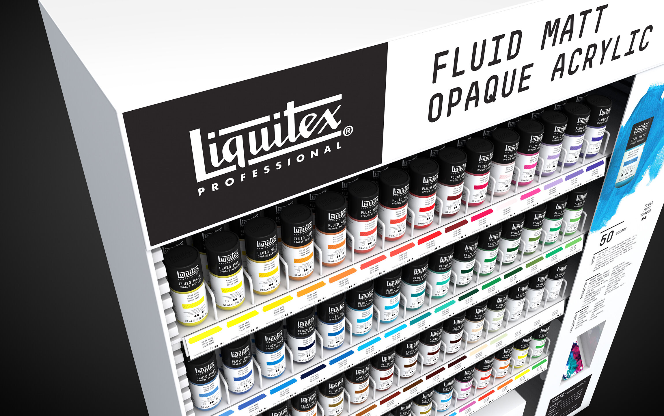
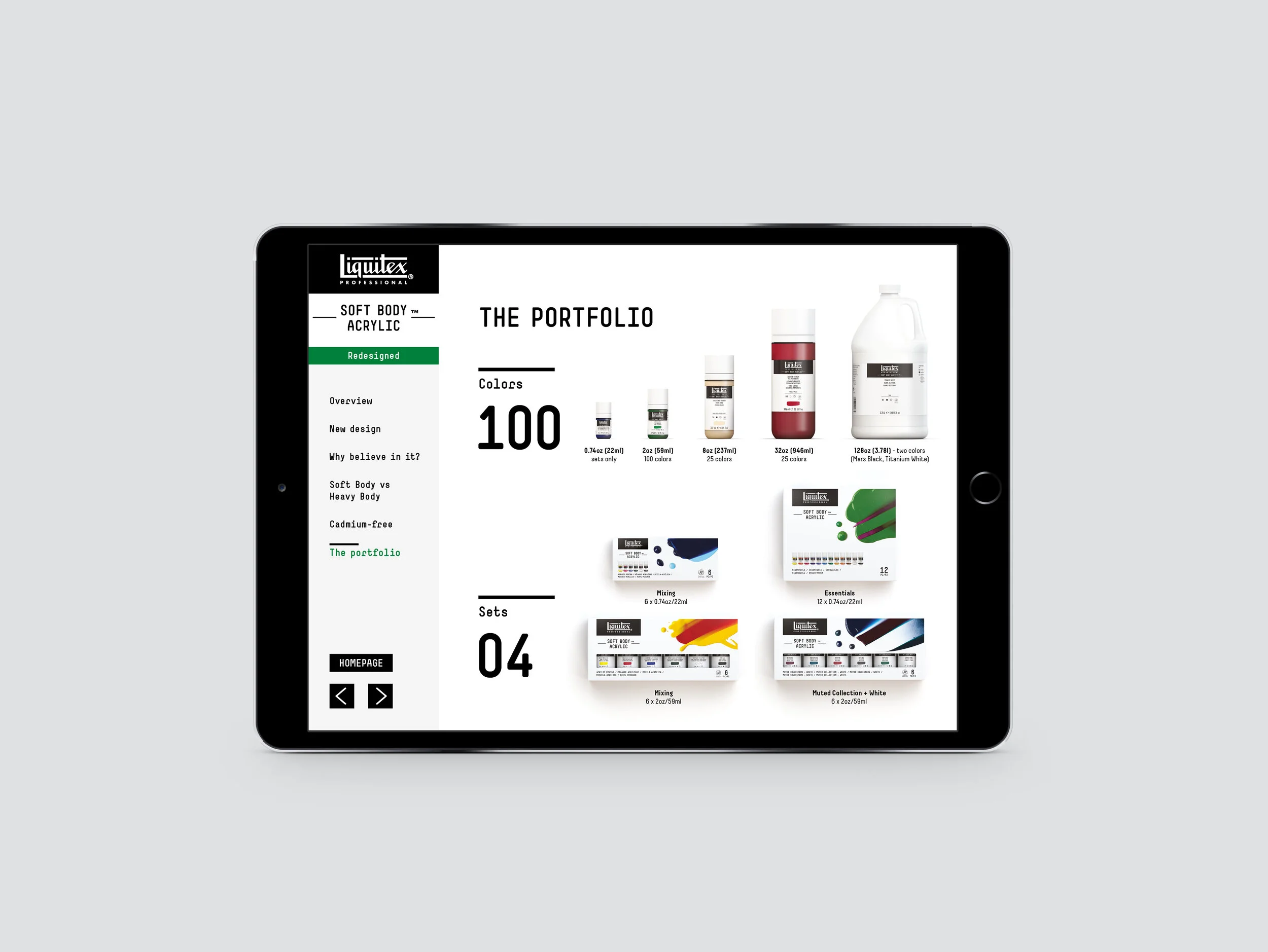
From packaging and literature to retail and digital, we explored how Liquitex’s new look would translate across all of their commercial platforms. Highly detailed renders provided key stakeholders with a cohesive new approach to merchandising and literature, whilst also demonstrating the finer details of novel packaging solutions.
Bespoke paint imagery perfectly captured the character and qualities of each range.


